Spanish GP: Strategy Review

Hamilton cruised to victory at the Spanish GP on Sunday 20 seconds clear of his teammate in second place. The race was a fairly easy one for the championship leader, especially once Ferrari decided to bring Vettel in under safety car and put on fresh medium tires. From there on out it was a simple case of staying on the track that brought Hamilton his second win of the year. 
Vettel was the first of the leaders to pit on Lap 18, attempting to undercut Hamilton who had a 7.5 second lead on him at the time. With a pit-lane delta of about 21-23 seconds, Vettel came out 30 seconds behind Hamilton after his out lap. Over the next 5 laps, Hamilton continued to stretch his lead over Vettel, even though the former was on fresh tires. By the time Hamilton pit on Lap 25 he had close to a 33 second over Vettel and would end up coming out of the pits with fresh medium tires 12.5 seconds in front of Vettel. 
Hamilton’s tire management during the first stint while he was on the softs was spectacular as he was able to pull out a lead on Vettel even once he had pit. It allowed the Mercedes car to go seven additional laps past what Vettel did on softs comfortably. This made his second and final stint, 40 laps on the mediums, relatively easy for Hamilton. 
Besides the difference in pit-stop laps between the primary contenders, the first stint strategy was what we had expected for this race. The interesting strategy component of the race came on Lap 41 when a virtual safety car was deployed. While Hamilton, Bottas, and Verstappen all stayed out, Vettel decided to pit from second place while the virtual safety car was out. He put on fresh medium tires, but because of a very slow 5.6 second stop from his team, he came out behind both Bottas and Verstappen. Had he had a good stop, he would have come out about one second in front of Verstappen but still behind Bottas. 
For the rest of the race, Vettel struggled to make up any time on Verstappen while Hamilton continued to pull away from the field. Vettel finished just off of the podium in fourth. 
Now, let’s break down the decision to pit Vettel under the virtual safety car.
If Vettel didn’t pit under the virtual safety car, he would have had to stretch his first set of medium tires 48 laps, which is right at the edge of how long the data indicated the mediums could go. Both Bottas and Verstappen would have had slightly fresher tires (2 and 17 laps) and be about 5 and 12 seconds back, respectively. The fact that the two guys behind him had fresher tires could have partially played into the decision to pit as well, especially if Ferrari had any thought that the other teams would need to pit as well.
What’s interesting is that Bottas had tires with 15 more laps on them than Verstappen at the end of the race and was only losing around two tenths a lap in the closing part of the race. This leads us to believe that had Vettel stayed out, he would had a good shot at holding off Bottas and a near lock on third place even if Bottas got by him. 
But this assumes Vettel’s tire wear would be similar to that of Bottas’, which it wasn’t. After the race Vettel said, “we were going quicker through the tires today” than other teams, so it’s unlikely the one stop strategy would have worked for Ferrari. The two stop strategy employed for Vettel on Sunday was necessary to get him to the finish. If he had more speed on the medium tires, he might have been better able to track down Verstappen for a podium finish at the end. 

While initially a head-scratcher during the race, after breaking down Ferrari’s strategy, it appears they made the right call by bringing Vettel in. If he and the team knew the tires weren’t working well for them at Spain, it was preventative to bring him in and get fresh tires for the rest of the race, especially under the virtual safety car when his loss of track position would be minimized. Leaving him out on tires that weren’t aging well could have put him at risk for a puncture or very poor traction at the end of the race, causing him to slip even further down the grid. 

What is the Indy 500’s Rookie Orientation Program?

Every driver who competes in the Indy 500 for the first time has to complete the speedway’s Rookie Orientation Program before being allowed to test the rest of the month and eventually qualify. The program is meant to get new drivers up to speed at Indianapolis’ 2.5 mile oval and show they can run laps safely and consistently before they are sent out with other drivers.

The program has three phases.

First, the driver has to run 10 laps in a range of 205-210 mph, followed by 15 laps at the 210-215 mph range. The final phase is 15 laps at 215+ mph.

The Rookie Orientation Program for this year’s Indy 500 will take place May 15th from 1-3 p.m. for Claman De Melo who has not already completed it. Wickens, Leist, and Kaiser completed the program earlier in the month.

Follow The Single Seater on Twitter!

Photo courtesy of Chris Owens/IndyCar


by Drew

Indy GP: Strategy Review

The winning pit-stop strategy for the Indy GP was most likely what the majority of teams were planning on before early incidents shook up the race on Saturday: a red-black-red-red three stop race that saw Will Power finish ahead of runner-up Scott Dixon by a little over two seconds.
An early incident between Charlie Kimball and Ed Jones as well as minor bumps between other drivers on the first lap of the race brought out a caution that affected the strategies of a third of the field. Eight drivers were forced to come in for premature pit-stops in the opening laps of the race, with many of them opting to stay on scuffed reds and get damage fixed only. Of the drivers that came in for early stops, the highest finishing was Simon Pagenaud who came through in eighth after starting one spot up from that. 
Power managed to stay out of trouble in the opening laps and execute his strategy almost perfectly, but not without a challenge from Robert Wickens first. Wickens, after switching onto fresh reds at the first pit-stop, overtook Power on the blacks for the eventual race lead on Lap 22. After the rest of the cars ahead cycled through the pits a few laps later, Wickens was in P1 on Lap 26. Power stayed close behind Wickens all throughout the second stint even though he was on the slower of the two tires, keeping Wickens within five seconds of him at all times as they neared the second stop.
On Lap 41 Wickens came into the pits to switch onto blacks while Power attempted to utilize the overcut and came in a lap later to switch onto reds. With the tire roles reversed, it took Power nine laps to break down the lead Wickens had built up and pass him for the race lead. Power held the lead from there on out, with a caution on Lap 58 bringing in essentially the entire field to switch onto fresh reds for the final stint.
With the fuel window for this race around 23-25 laps, the final 27 lap stint was a fuel saving one. This played well for veterans Power and Dixon who had no trouble making their fuel numbers, but IndyCar newcomer Wickens struggled greatly in the final stint. With no prior experience in fuel saving in an IndyCar, Wickens was overtaken by Dixon easily and then slipped back to Sebastian Bourdais but managed to defend his position for the final laps and finish on the podium. 
Power’s strategy was what was to be expected from the pole-sitter of this race. Starting on the fast tires, a switch to blacks, and then back on reds for the final two stints to finish fast. Wickens took an alternative approach by taking red tires at the first stop. This wasn’t a bad decision as he was able to overtake Power when he needed to and even build a gap on him. The problem came when he had to use blacks and Power could use the reds: he didn’t have the speed on blacks to keep Power from regaining the lead and it dropped him to second. Once the final fuel saving stint started it was all over for Wickens, even though both drivers had fresh reds to compete on. He didn’t have the experience Power did hitting the fuel numbers and there was no chance he was catching him.

Dixon started the day in eighteenth and finished in second thanks to an alternative strategy spearheaded by Mike Hull. He was one of the six drivers who started on the black tires and went on to take three sets of reds at the pit-stops. He pit early on Lap 13 to get off the primary tires as soon as possible while still keeping the race a three-stopper. From there on he settled into the race, slowly picking his way through the field as he completed twelve passes on the day. Because Dixon had good pace on the blacks and had actually gained five spots after the first lap thanks to incidents by other drivers, he was able to set himself up for a good run on the reds later on. 
He didn’t need to worry about switching onto slower blacks at one of his stops and could instead focus on picking through the field on quick reds and simply making up time. This strategy is one that required the experience of Dixon to pull off. He needed to be okay running somewhat alone when he went off cycle early and pacing himself to the times required to make the strategy work. When it got to the final stop and fuel saving time, he was already in P4 and just had to use his experience to pass Wickens and Bourdais while hitting fuel numbers. 
The three different strategies the top finishers utilized were all effective in getting them onto the podium. Wickens and Power’s strategies were essentially interchangeable and I feel that if they had run each other’s, the results would be the same. It came down to speed and Power had more of it, no matter the order the reds and blacks were used on the second and third stints. Dixon’s on the other hand was definitely a brilliant one for a veteran driver starting in the back. He worked his way through some slower cars on the blacks and got help from incidents as well, and then it was three sets of reds to move him the rest of the way up the field.

Follow The Single Seater on Twitter!

Photo courtesy of Matt Fraver/IndyCar


by Drew

Aging Curves For IndyCar Drivers

Aging curves are very popular on baseball analytics sites like Fangraphs and Baseball Prospectus. They give a forecast as to how a typical player ages over time and how their batting average, WAR, or some other statistic might change with the seasons to come. They give a best guess as to how a player will age, so while it is by no means a perfect representation of player aging, it is helpful. The real benefit of aging curves are that they can help us forecast a player’s (or driver’s in our case) performance in future seasons based on how he’s performed so far. No one has really tried to do the same for IndyCar, though David at Motorsports Analytics has done something similar for NASCAR, so I thought I’d give it a try. 
The basic technique behind constructing an aging curve is this: look at back to back seasons for many different drivers and see how a statistic (for example average finishing position or AFP) changes between those years. Put these “changes” into a bucket representing the ages, find the average change from say age 32 to 33, and then do this for all of the age pairings in your data set. For example, in 2013 Scott Dixon was 32 years old and had an average finish of 8.2. The next season he was 33 and had an average finish of 8.3, so his change between ages 32 and 33 is +0.1 average finishing position. This would go into the general 32/33 bucket for every driver who raced in back to back seasons at those ages. Once all of the 32/33 changes are put into the bucket, the entire bucket is averaged together to get the average change for a typical driver between those ages. 
This is called the delta method for constructing an aging curve because it looks at the average change from one year to the next in back to back seasons. I created three different aging curves for IndyCar drivers. One for average starting position, one for average finishing position, and one for championship position. I looked at 43 different drivers. To be include in the data set, the driver had to race in at least two back to back seasons from 2002-2017 and race in at least five races each season. This provided a total of 273 seasons from which to develop the aging curves.
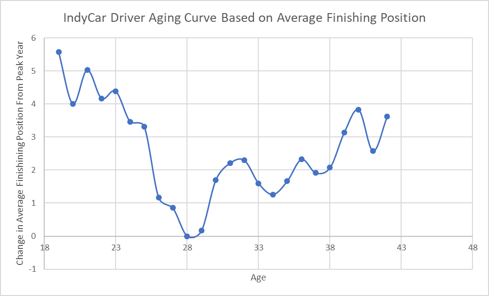
Here is a look at the aging curve for average finishing position. 
If you have ever seen an aging curve for baseball before, you might be a little confused by this. In baseball, players want to have a high batting average or WAR, but in racing and with the statistics we’re looking at, you actually want a lower number. So the aging curve looks flipped when compared to this one for baseball. The y-axis is the change in average finishing position from peak year. Moving down the y-axis indicates a decrease in averaging finishing position (ex: moving from an average finishing position of 17th to one of 11th). For example, when a driver is 23 years old, he’ll be projected to shave a little over four places off of his current average finishing position by the time he reaches age 28 — this is the peak age for average finishing position performance. So if a driver has an average finishing position of 14th when he’s 23, we’d expect him to be have an average finishing position of 10th in five years time, based on how a typical driver ages. This graph also shows the year to year change for different age couplets. Going from age 34 to 35, a typical driver’s average finishing position increases by 0.4 places, meaning he is less successful than the year before.

The key to remember when reading aging curves is that an increase in average finishing/starting/championship position is a bad thing (AFP of 14.5 going to 16.7) and a decrease is a good thing (AFP of 20.1 going to 14.2). It doesn’t sound quite right at first, but that’s just the nature of starting/finishing/championship position in IndyCar.

Overall, the average finish curve shows us that drivers drop a little over half a place off of their average finishing position per year until age 28. After that, it is a gradual increase as the driver comes out of their prime years and starts moving down the grid again. Drivers lose their abilities much slower than they gain them, with a fair number of drivers even having better seasons than expected as they get older because of this.

The aging curve for average starting position is read exactly the same way as average finishing position, with lower numbers meaning a driver is closer to the peak age performance.

What’s interesting about this aging curve is the dip that occurs when going from age 20 to 21, even though the peak age still turns out to be 28. This clearly isn’t what we’d expect to happen from a “typical” driver, and it’s caused by the relatively small sample size of drivers in that age group competing in back to back seasons. When using this aging curve for projections, I adjust for this anomaly by providing less weight to that couplet.

Drivers seem to lose their qualifying abilities quicker than their racing abilities: by age 38, a driver has lost about 4 places off of their peak average starting position compared to just 2 places off of their average finishing position at the same age. This speaks to the idea that being consistent and safe throughout a race can pay off in the long run. In qualifying, drivers only need to get through one quick lap to place high. In a race, you need consistent laps and to stay out of trouble for over an hour and a half of racing in order to finish in a good position. Drivers who have a lot of experience are able to maintain high average finishes for a long time because they know this better than the younger drivers who are new to the series. Younger drivers seem more willing to take risks which can pay off in high average starting positions (think of the dip at age 20/21), but these don’t always translate to high average finishing positions as we saw above. It’s much easier to get away with “on the edge” driving for one lap compared to 80.

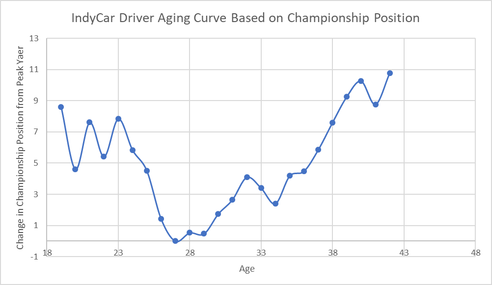
And finally, we have the aging curve for championship finishing position.

The championship aging curve shows that the peak year for championship position is right around the age of 27. At first glance this might surprise you given that the average age of the champion has been close to year 30 years old for the years 2000-2017, but remember that this is an aging curve for all drivers, not just drivers that went on to win the championship. On average, drivers are achieving one of their best championship finishes around the age of 27. Early on in their careers, drivers experience a lot of variation in season to season performance in the championship. This is likely because a few good results — which might be the result of luck early on — can boost drivers up the standings a lot when they are near the back in points. After drivers hit 23 their performance becomes more predictable throughout the rest of their career. Drivers drop back roughly 0.75 places in the points standings each year after the age of 28.

As I mentioned before, aging curves are not a perfect forecast: they are just our best guess based on how typical drivers have aged. One of the main drawbacks of aging curves, and a problem with every sport, is called survivorship bias. This is the idea that only the best drivers will be included in the later age ranges because all of the worse performing drivers will have been let go by then. If a driver isn’t good, he won’t stay in the series for long and he won’t have many back to back seasons to use. This is especially a problem in the first few seasons as new drivers come and go having only raced in one or two seasons. After that things start to even out and the survivorship bias doesn’t matter as much because most of the drivers in the series are typical of the rest of the drivers who have made it that far too. This is something to keep in mind when looking at aging curves.

There is a lot that can be done with aging curves and a lot that can be learned from them — too much to include all in one article. Here are the main takeaways from the aging curves and what we’ve looked at in this post:

  1. The typical driver peaks in average finishing and average starting position around the age of 28. 
  2. Drivers lose their ability to have a high average starting position quicker than their ability to have a high average finishing position. This is possibly due to younger drivers’ willingness to take risks in qualifying and the better experience older drivers have in managing race situations.
  3. There is a lot of early volatility in how drivers perform in the championship early on in their career. This evens out as their career goes on.
  4. Survivorship bias is an important thing to remember when evaluating aging curves.

As the season gets closer and the rest of the vacant seats get filled, I will post my projections for the 2018 IndyCar season based partly on these aging curves for each driver’s average starting/finishing position and their championship position. Look out for those!

Follow The Single Seater on Twitter!

by Drew

Don’t Try to Predict Where a Driver Will Finish Based on Where He’s Starting

The general consensus has always been that the higher up you start in the grid, the higher you’ll finish in the race. This makes sense. The fastest cars qualify at the front of the grid and we expect them to perform well in the race too. But what exactly is the relationship between starting position and finishing position? Can we tell a lot about where a driver is likely to finish based on where he starts? These are a couple of the questions I want to look at today.

Using data from 2012-2017, I looked at how starting position correlates with finishing position. Here’s a plot of finishing position vs. starting position for those years, with a trend line added.

A driver’s starting position explains only 12.9% of their variation in finishing position, meaning that a driver’s starting position isn’t very predictive of their finishing position. If you just know where a driver started, you can’t predict their finishing position with much accuracy. I was expecting this number to be a little higher, but the more I thought about it, the more it started to make sense. 
There are a lot more factors that go into where a driver ends up finishing a race than simply where he starts. Accidents, untimely cautions, and differences in strategy are just some of the things that can make high qualifying drivers perform poorly and let poor qualifying drivers sneak into the top half of the field. Qualifying position is only one part of the puzzle that determines the results of a race. And on top of that, the difference between say 12th and 13th place is usually down to more luck of the draw then driver skill, making the prediction of individual places difficult. 
But this leads us to another question: what are the factors that truly impact where a driver finishes a race. Are practice results predictive of race performance? Or how a driver has raced at that track in the past? Or is racing inherently subject to a lot of randomness and it can’t be predicted with much accuracy? These are all interesting questions that I would like to tackle in the future, but trying to determine how they all interact with each other would be too much for one article. I would like to look at these factors one by one in different articles in the future (starting with qualifying position in this one). Race prediction is obviously the ultimate goal, but before we can determine if it’s even a feasible goal, we need to see what the different factors are that go into determining where drivers end up in a race. 
What we do know now is one part of the bigger picture: qualifying position is a statistically significant predictor of finishing position, but it isn’t a very good one. It explains just around 13% of the variation in finishing position and has a standard error of 6.7 places. Qualifying is a good place to start our investigation into finishing position, and I plan on looking at the other aspects that go into race performance in future posts.
by Drew