The winning pit-stop strategy for the Indy GP was most likely what the majority of teams were planning on before early incidents shook up the race on Saturday: a red-black-red-red three stop race that saw Will Power finish ahead of runner-up Scott Dixon by a little over two seconds.
An early incident between Charlie Kimball and Ed Jones as well as minor bumps between other drivers on the first lap of the race brought out a caution that affected the strategies of a third of the field. Eight drivers were forced to come in for premature pit-stops in the opening laps of the race, with many of them opting to stay on scuffed reds and get damage fixed only. Of the drivers that came in for early stops, the highest finishing was Simon Pagenaud who came through in eighth after starting one spot up from that.
Power managed to stay out of trouble in the opening laps and execute his strategy almost perfectly, but not without a challenge from Robert Wickens first. Wickens, after switching onto fresh reds at the first pit-stop, overtook Power on the blacks for the eventual race lead on Lap 22. After the rest of the cars ahead cycled through the pits a few laps later, Wickens was in P1 on Lap 26. Power stayed close behind Wickens all throughout the second stint even though he was on the slower of the two tires, keeping Wickens within five seconds of him at all times as they neared the second stop.
On Lap 41 Wickens came into the pits to switch onto blacks while Power attempted to utilize the overcut and came in a lap later to switch onto reds. With the tire roles reversed, it took Power nine laps to break down the lead Wickens had built up and pass him for the race lead. Power held the lead from there on out, with a caution on Lap 58 bringing in essentially the entire field to switch onto fresh reds for the final stint.
With the fuel window for this race around 23-25 laps, the final 27 lap stint was a fuel saving one. This played well for veterans Power and Dixon who had no trouble making their fuel numbers, but IndyCar newcomer Wickens struggled greatly in the final stint. With no prior experience in fuel saving in an IndyCar, Wickens was overtaken by Dixon easily and then slipped back to Sebastian Bourdais but managed to defend his position for the final laps and finish on the podium.
Power’s strategy was what was to be expected from the pole-sitter of this race. Starting on the fast tires, a switch to blacks, and then back on reds for the final two stints to finish fast. Wickens took an alternative approach by taking red tires at the first stop. This wasn’t a bad decision as he was able to overtake Power when he needed to and even build a gap on him. The problem came when he had to use blacks and Power could use the reds: he didn’t have the speed on blacks to keep Power from regaining the lead and it dropped him to second. Once the final fuel saving stint started it was all over for Wickens, even though both drivers had fresh reds to compete on. He didn’t have the experience Power did hitting the fuel numbers and there was no chance he was catching him.


Dixon started the day in eighteenth and finished in second thanks to an alternative strategy spearheaded by Mike Hull. He was one of the six drivers who started on the black tires and went on to take three sets of reds at the pit-stops. He pit early on Lap 13 to get off the primary tires as soon as possible while still keeping the race a three-stopper. From there on he settled into the race, slowly picking his way through the field as he completed twelve passes on the day. Because Dixon had good pace on the blacks and had actually gained five spots after the first lap thanks to incidents by other drivers, he was able to set himself up for a good run on the reds later on.
He didn’t need to worry about switching onto slower blacks at one of his stops and could instead focus on picking through the field on quick reds and simply making up time. This strategy is one that required the experience of Dixon to pull off. He needed to be okay running somewhat alone when he went off cycle early and pacing himself to the times required to make the strategy work. When it got to the final stop and fuel saving time, he was already in P4 and just had to use his experience to pass Wickens and Bourdais while hitting fuel numbers.
The three different strategies the top finishers utilized were all effective in getting them onto the podium. Wickens and Power’s strategies were essentially interchangeable and I feel that if they had run each other’s, the results would be the same. It came down to speed and Power had more of it, no matter the order the reds and blacks were used on the second and third stints. Dixon’s on the other hand was definitely a brilliant one for a veteran driver starting in the back. He worked his way through some slower cars on the blacks and got help from incidents as well, and then it was three sets of reds to move him the rest of the way up the field.
Follow The Single Seater on Twitter!
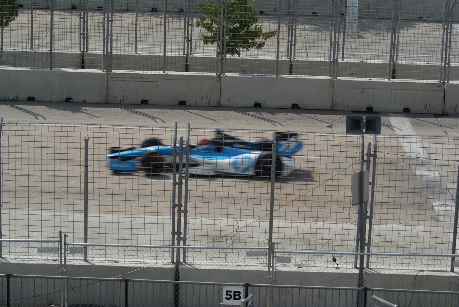
Photo courtesy of Matt Fraver/IndyCar
by Drew